In the how we work page, we discuss the technical and step-by-step execution of building a website.
Here, we focus on the design, look, and feel aspects of web design.
As we mentioned, global graphic design is not as crucial as it used to be. Most users rely on portable devices with limited screen sizes. Even a “big” smartphone usually has a screen between 5 and 6 inches. Therefore, not much of a design can shine through text, logos, links, and pictures.
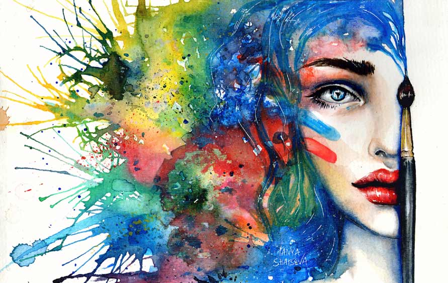
Remember: most of the visual impact comes from the images.
Additionally, the design must be responsive, adapting to any screen size. It is not a static painting with a defined size and shape.
Among the countless websites worldwide, the most successful ones are easy to use and often share common features:
- Logo/name on the upper left
- Prominent search box (if any)
- Contact details
- Corporate motto/slogan/title
- Some links
- Main image
- Main call to action or promotion
- All the rest
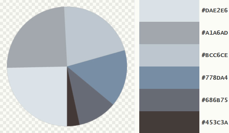
Our aesthetic preference tends toward an almost flat design using palettes inspired by modern colors used in marketing, road signs, and stationery items. These colors either serve particular functions or harmonize with the main image on your website's home page. For instance, you can use this color tool.
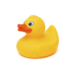
With that tool, you can generate a color palette for your website based on the main image:

Above: the image, Below: the colors

and we always add a red for emphasis
The design can be implemented with some cards when necessary:
This is a card
The card is used to divide the content of a web page by concepts. It can contain a small description and a link to the topic. The most common example of card is in e-commerce: all the products are usually contained in a card.
E-commerce cards example
Responsive Design
A responsive design ensures your website looks good on all devices. It's essential to test your website on different screen sizes to ensure the best user experience.
Responsive design: try to resize this creen (or rotate if on mobile)
E-commerce card

100 THB
Add to cart
Importance of SEO
SEO (Search Engine Optimization) is crucial for making your website visible in search engines. Implementing best practices can help drive traffic and improve your site's ranking.
Learn more about SEO
Using Images


Also important are clear textual menus:
Example link 1 Example link 2 Example link 3
Example link 1 Example link 2 Example link 3
Example link 1 Example link 2 Example link 3
We apply a policy for the limited use of font classes, only lightweight (try to check the weight of the file that will contain that type of font, usually is .woff or .woff2) for a fast loading of the web page. We use Google Fonts or Online Web Fonts, the kind you can download and upload to your server.
Images with captions and slideshows or picture galleries when requested.
Talking about look and feel and visual effects is difficult.
So we have some templates for you to check. If you stick to our templates, the price of building a website will be very competitive. Also available are websites using modern and fast frameworks for all the browsers and devices in circulation, here you can choose some.
Most customers like to take inspiration from the web itself. They indicate a website they like for us to reproduce it but paying attention to NOT COPYING IT! Even if a website is really well done and works fine with high usability, the same functions might not work well in your business context. So don’t search for a duplicate of a website, just indicate a way you like.
There is nothing wrong with looking for inspiration on the web and simulating other websites' look and feel or layout. You can indicate elements for your website from the web and let us incorporate them into your web design. Of course, we will not copy the images themselves or the code.
It is perfectly legal to recreate websites similar (not exact replicas) to others using custom code. And we do code HTML by ourselves.
The legal aspects of copyright infringement are quite complex when talking about similar “look and feel”, general “layout” that changes in infinite ways depending on screen size, or “website concept”. The law is very clear about NOT replicating the same "pictorial, graphic, sculptural works, literary works" and "computer programs (code)". However, there is no clear definition of “look and feel”, at least in American legislation at the time of writing. For example, in England, if there are at least six differences, an "article" is not considered the same. Furthermore, an aesthetic copyright to be protected must be particularly original, and websites usually are not: logo on the top left, links, main image, description. "Round" image of the user profile is almost in all UI (User Interface), and so on with many similarities.
Moreover, most corporate websites, even big names like Airbnb.com, use common frameworks that share code, design layout, and behavior depending on screen resizing with thousands of other websites. You will find the same code, properties, shadows, “look and feel”, browser behavior, and even button styles and color classes. And to be copyright protected, the design should also be an “original work”, and the use of public open-source framework removes the word “original”.
Another matter is reproducing the exact same website to let visitors think that they are on another website, like copying a bank website or an online e-commerce site to sell goods. This is for malicious purposes, and the problem is not copyright infringement; it is fraud.
So be perfectly sure that it is normal to take inspiration from existing websites.
Also, users are expecting and are happy to find resemblances: the home page link in the same place, the captcha that works in the same way on any website, as well as other features that will simply help them navigate faster and reduce the learning curve of using a new website.
A quote by Henry Ford: "Any customer can have a car painted any color that he wants so long as it is black".
User Experience (UX) Design
User Experience (UX) Design is critical in creating websites that are not only visually appealing but also functional and easy to navigate. A well-designed UX ensures that users can find what they are looking for quickly and efficiently, enhancing their overall experience on your site.
Key Elements of UX Design:
- Intuitive Navigation: Make sure your website’s navigation is simple and easy to understand. Users should be able to find their way around without confusion. Use clear labels for menus and logical page hierarchies.
- Fast Load Times: Optimize your website to load quickly. Users are likely to leave a site if it takes too long to load. This can be achieved by compressing images, minifying CSS and JavaScript files, and leveraging browser caching.
- Accessibility: Design your website to be accessible to all users, including those with disabilities. Use alt tags for images, ensure sufficient color contrast, and provide keyboard navigation options.
- Responsive Design: Ensure your website looks and functions well on all devices, from desktops to smartphones. A responsive design adapts to different screen sizes, providing a seamless experience across all devices.
- Clear Call-to-Actions (CTAs): Use prominent and clear CTAs to guide users towards the desired actions, such as signing up for a newsletter, making a purchase, or contacting you for more information.
- Consistent Design: Maintain a consistent design throughout your site. Use the same fonts, colors, and styles to create a cohesive look and feel.
By focusing on these key elements, you can create a website that provides a positive user experience, leading to higher user satisfaction, increased engagement, and better conversion rates.
Disclaimer
The companies mentioned in this article are based on our personal experience and editorial judgment, not on objective tests. Non-mentioned companies should not be considered inferior; there are many other reliable providers that may also meet your needs.

