HOW WE WORKwebdee-seoservice.com 339/753 M. 12 Pattaya 20150 Thailand Tel. 0846363279 info@webdee-seoservice.com
How We Build a Website
Web design & construction: the ideas, the techniques, the code, the timing, and the results.
Starting from the name and logo till the full realization of a fast and perfectly working website.
How We Work
How We Build a Website Standard (static) websites, e-commerce, websites with booking functions, and other common websites
We consider ourselves different from most. We don't just "design"; we study and project a website.
We listen to the customer and then provide a quotation. No time is spent on studying and making a project at this stage. After the customer approves or suggests amendments to the quotation, we start studying the website. This study is done "behind closed doors." Then, we begin the real executive project and interact with the customer following various steps.
This infographic is a schematic diagram of our step-by-step website creation process.
Contacts
The customer contacts us via email, telephone, or any other communication means, and we start a correspondence to understand each other, culminating in our quotation.
Study
We conduct a dedicated study. We consult online with other webmasters globally via live chat, video chat, email, and social working networks until we have enough ideas on how to proceed with the latest trends and/or well-tested solutions.
Note: We discuss the project but never disclose names and details, respecting typical commercial NDAs (Non-Disclosure Agreements).
Interactions
We submit our project to the customer for approval, including new ideas for future development and/or corrections.
Construction
We start coding the website and add some content, such as titles and introductions for each page, as well as more consistent content for the homepage received from the customer.
Deployment
The website goes online, either live or restricted to the customer and us. We (including the customer) will test functionality, visual resolution, mobile compatibility, and speed. The customer will start to add content.
Note: We provide training in using the CMS or e-commerce platform via remote desktop tools like TeamViewer or other equivalent systems, or we receive content by email to post on the website.
Updating
When necessary, we update the system. The customer can constantly (if needed) update their content. We provide a monthly backup.
The above procedure applies, with variations, to most websites.
In specific cases, such as high-traffic websites or other peculiar requests, customers will be advised accordingly.
Below you can read more technical details, such as website architecture, structure, functional layout, user interface, coding, web design, speed, and security.
It can be boring, so feel free to skip it and let us handle the details. Proceed directly to buy the website from us! ☺
For functional layout and UI (User Interface), we consider all the technical aspects of how the website appears in a browser on any device: from desktops to small smartphones, on fast internet fiber connections to slow SIM internet connections.
There are many important points to consider. While creating a user-friendly interface for a desktop website is relatively easy (allowing visitors to get information at a glance and start interacting), achieving this in the "above the fold" section of a mobile screen is quite challenging.
The fact is simple: it is impossible to fit everything into it. So, some elements must be left out. But what? This is where extensive experience in SEO and website creation comes into play, enabling the right choices.
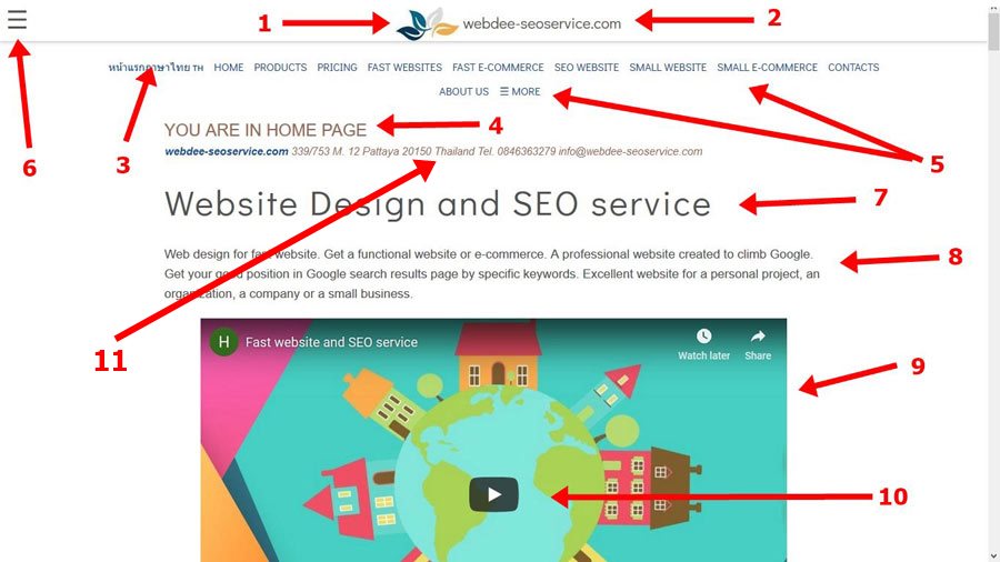
In the following infographics, you will understand the above the fold concept of the home page and its optimization, which is the most important part of any website, both on desktops and in mobile browsers.
In the above desktop infographic, you can see we satisfy 11 points:
Logo The logo is very important. People recognize you first by the logo, secondly by the images, and finally by the name.
The URL The website name is important not just for recognition but to give visitors a URL to memorize and return to. Google will guide visitors back to your website even if they misspell your name. How many times have you ended up on a website after a search and then couldn’t remember the URL?
The language switch If you have a multilanguage switch, place the language options in a well-visible location.
Page name or breadcrumbs menu Immediately providing the page name to the visitor is a good and useful practice.
Navigation menu The more links visible on the website, the better. It’s understandable that placing all links can be virtually impossible on some websites. On the other hand, hiding everything in a menu symbol to click on is too reductive. When a clear list of pages (links) is absent, many people will feel disoriented and not know what to do next.
Hamburger menu The famous symbol present in almost all mobile versions of any website to hide the menu. As stated in point 5, it is important to show the actual textual links. If the links exceed the shown number, then a “more links” link AND a hamburger menu symbol should be added. Relying only on the menu symbol is a common mistake.
Page title The title or subject of the page.
Page description A description of the page to help visitors understand more about the website/page or services/products.
Image (or video) An image is mandatory to tease and entertain visitors.
Play button If a video is present, apply a “play” button instead of automatically playing the video. Auto-play can be annoying, slow down the smartphone, and lead the visitor to leave the page.
Contacts Prominently displaying contact details indicates a quality page. A website where people have to navigate or fill a form as the only way to contact can generate a loss of trust.
As it is impossible to include everything we want, unfortunately, we did not satisfy more points, even if they are important. Here is what is missing:
Special offers A good deal, special offer, or promotion of the moment/season is a good marketing practice.
Search box The search box is very important. There must be a good reason to justify its absence.
Photo gallery with animation The adage "One Picture Worth Ten Thousand Words" holds true on the web as well. In the case of an animated slideshow, include buttons to allow users to navigate back to previous images.
Interactive form or call to action A form through which visitors can start using your services. Examples include a booking form for a hotel, airline, or dentist; a search box for a real estate agency; a login form for member-only services; a dropdown menu of destinations for a travel agency or weather website; or a fast food delivery website, among others.
Subscribe form A field where visitors can insert their email to receive a free manual, download drivers, or other resources.
Get started button Allows visitors to start a process leading to membership or starting a free trial.
As you can see, we made deliberate decisions to omit certain functions in favor of others. While every decision is open to debate, when made with understanding and extensive experience, it can yield better results. Here are the even more restrictive decisions applied to mobile design:
Notice that even the page description and main image are missing! However, the menu is still present, albeit in a condensed form. If we go smaller, like on a 3.5-inch screen, even the prominent URL will disappear, remaining only in the contacts area.
To gain a bit more space, we could substitute the page name "YOU ARE IN HOME PAGE" with breadcrumb navigation. Instead of a prominent language switch link, we could use a single flag and remove other links, replacing them with something like "Click here for the menu". However, we chose the current approach based on various factors.
Several considerations influenced these decisions. Firstly, due to the nature of our website, we lack a specific and unique call-to-action button. Additionally, as a less prominent entity compared to Netflix or Spotify, it's crucial to inform Google about our page's content to improve search visibility. Therefore, multiple textual links with titles and additional information are essential rather than a sparse page with a single call-to-action button.
Conversely, a landing page linked to a Google AdWords campaign might require a different approach, optimizing for a single product, service, or option to cater to visitor expectations.
Conclusions
Depending on the website's purpose, scope, target audience, and other marketing considerations, the appropriate visualization of components will vary. Thus, a case-by-case study is more valuable than strictly adhering to SEO or UI guidelines. By the way, we currently support only one language!
Speed, fast loading under any internet connection, is a top priority for webdsee-seoservice.com.
For a more in-depth discussion on the importance of speed, you can refer to Google's article on speed matters.
Without delving into all the technical details, consider your own experience: you're likely to be disappointed if:
A website loads slowly.
Pages fail to appear.
The information you seek doesn't show up.
Your browser crashes.
Nobody likes slow websites. Statistically, 40% of visitors will leave a web page if it takes longer than 3 seconds to load!
We utilize fast hosting services from hosting-international.com (simply search "fast hosting" or "hosting fast" on Google and depending on your location, hosting-international.com will likely appear on the first page).
When we code websites, we always prioritize speed. This means you can expect a fast website from us.
Website Structure Architecture
In web construction, "structure" or "architecture" refers to how files and folders are organized within the hosting environment. Here are two infographics to illustrate this (apologies for the straightforward filenames):
Files are organized in different foldersFiles are organized together in few folders
As seen in the first example, files are spread across various folders, while in the second, they are consolidated. The organization of files and folders primarily serves practical and mental order for programmers, rather than impacting speed, visibility, or SEO. External files outside the domain serve specific purposes.
However, internal linking—both across pages and within specific points on a page (anchors or bookmarks)—is crucial for user-friendly navigation and accessibility.
Equally important is our approach to file naming. We avoid generic names like image_1 or file.html, opting instead for descriptive names such as fast-e-commerce-infographic.jpg or pricing-of-ready-to-use-website.html.
Coding
As discussed in the functional layout and user interface section, customization is key in our web design approach.
To meet our stringent speed requirements, we ensure our websites are lightweight in coding.
For security reasons and efficiency, we predominantly use HTML/PHP with minimal JavaScript, reserved for essential functionalities only. This helps mitigate the common internet issue of excessive JavaScript found in plugins and unnecessary elements across websites. JavaScript remains valuable but is best utilized for more specific tasks such as interactivity and dynamic content, while CSS handles layout and design.
Yes, HTML websites can still integrate Content Management Systems (CMS) for easy content and image management. Here's an article about HTML CMS.
For more complex functionalities like blogs, we deploy typical CMS platforms like Google Blog (blogger.com), CMS Made Simple, or WordPress. Larger e-commerce projects benefit from open-source platforms that are lightweight and easily customizable for advanced needs.
Don't be intimidated by the term HTML (or PHP); it's more approachable than you might think, and you won't need to learn it yourself—we handle all the coding for you.
One limitation to note: once a theme is chosen, changing it isn't as straightforward, but adjustments like color and font changes are easily manageable.
Design
Web design: We don’t simply “design” websites; we approach each project as a cohesive endeavor.
Yes, "project" better encapsulates our work—our method of making websites function effectively.
Nowadays, it's evident that people use various devices to browse the internet, from smartphones to tablets and laptops. In most cases, users seek information quickly, often on the go, without focusing extensively on design due to limited screen space. What matters most are texts, logos, information, and images rather than the entire website layout. Therefore, our preferred "look and feel" involves a white background with information listed by importance, ensuring a user-friendly interface with clear links and a recognizable logo.
The logo plays a crucial role in helping visitors identify your website, surpassing the importance of overall design. To serve this purpose effectively, the logo must be simple—almost as simple as an icon.
Ultimately, our approach to web design revolves around logo, links, main information, and images.
We offer a selection of pre-made themes and templates to choose from. Explore them on our fast website page. Some clients prefer to reference a website and say, "I want something like that." We respect copyright and aim not to replicate designs exactly, but rather to capture the essence of an existing site. This approach saves time on theme customization, which can be challenging with CMS limitations. We deliver attractive websites in HTML customized versions.
To add refinement, we can work with color harmonies, fonts, or suggestions from clients. Learn more about web design in our web design article.
Timing
We respond promptly to email inquiries. After initial correspondence with a client, we can provide a quotation within hours.
If a client has a clear vision, we can start immediately. For example, a simple 7-page website would take one week (excluding client-provided content) or two weeks with content integration.
If additional planning is required for the website, we allocate an additional 4 working days for preliminary focus on the project.
For e-commerce projects, the timeframe is typically one week (excluding payment gateway setup and planning phases).
Our timetable is straightforward, although each project is unique. Timing starts upon receipt of funds.
Cooperation from clients significantly accelerates the website creation process. We request clients to prepare or commission:
Visual Content
Logo
Favicon
Photographs
Media (video and audio, if applicable)
Product descriptions
General text content
Team bios and headshots
About page content
Page names and categories with titles and introductions
Social media links
Previous blog posts for migration to the new website
And, for all projects:
Company contact information (address, phone, hours, etc.)
Legal notice
For e-commerce projects:
Several categories
Multiple product descriptions with images and prices
The security of a website is often given minimal consideration, but at Webdee-seoservice.com, we prioritize this issue.
While you might not be establishing a bank where IT security is critical, preventing fraudulent access is crucial at all times.
Many people mistakenly believe that in the worst-case scenario of a website being hacked, they can simply change the password and restore the site from a backup. However, this is an overly optimistic scenario.
The real danger arises when a hacker gains access to your website or hosting environment and instead of causing obvious damage like deleting files (which you may have safely backed up), they remain undetected. If the hacker is a competitor, they might silently read your emails without alerting you to the breach. If they are more sophisticated, they may sell access to criminal organizations who could use your site for illicit activities, distribute malware, or engage in other illegal transactions.
If malware planted on your site is detected by Google, Firefox, or antivirus scanners, your site could be blacklisted, disrupting all email traffic associated with your domain. However, even worse consequences can occur if government agencies or law enforcement link your site to criminal activity, leading to serious legal implications.
Security Recommendations
We take several precautions to prevent breaches:
Using less widely known CMS and e-commerce platforms.
Avoiding unnecessary plugins and regularly checking system vulnerabilities.
Keeping systems updated.
Unfortunately, these measures alone are not sufficient. Over 90% of breaches occur due to compromised usernames and passwords. Hackers employ various techniques to steal passwords, including phishing, keyloggers, intercepting unprotected Wi-Fi signals, or exploiting careless password practices such as sharing passwords online, using easily guessable passwords, or never changing default passwords.
We offer monitoring of your website and hosting traffic to detect brute force attacks and identify malware, but the most effective security measure is for users to be vigilant in securing their own systems.